GloomyGiggles chattering-teeth mascot
The Art of VicTorres

Gloomy Giggles

Acrylic satire for a country that's lost the plot. Politics, pop culture, and robots with an attitude problem — and completely unhinged.

See the Gallery
Scroll ↓

Selected Artwork

A closer look at the world of VicTorres. Tap a painting to see the full image.

All Work →

The Artist

VicTorres at the Unisphere, Flushing Meadows VicTorres at the NY State Pavilion

VicTorres

Artist. Troublemaker. Professional overthinker.

I grew up with ink on my fingers and static on the screen — raised by a paper trail of MAD and Cracked magazines and the waxy smell of VHS rentals. My early education was in the margins of satire and parody, where Garbage Pail Kids cards and the wild, exaggerated art of MAD and Cracked collided in my brain like a beautiful car wreck. I wasn't just laughing — I was studying.

Victorres isn't just a name. It's a broadcast signal. Scrambled, sarcastic, and stubbornly analog in a digital world. Always rolling film. Always hitting "record."

Full Artist Statement →

I grew up with ink on my fingers and static on the screen—raised by a paper trail of MAD and Cracked magazines and the waxy smell of VHS rentals. My early education was in the margins of satire and parody, where Garbage Pail Kids cards and the wild, exaggerated art of MAD and Cracked collided in my brain like a beautiful car wreck. I wasn’t just laughing—I was studying. Artists like Jack Davis, Mort Drucker, John Severin, Angelo Torres, and Tom Bunk weren’t just cartoonists—they were visual assassins, taking down pop culture with crosshatched precision. The detail, the chaos, the character work—they turned every page into a dense, exploding battlefield of ideas. Garbage Pail Kids—especially the work of John Pound, Tom Bunk, and Jay Lynch—felt like their bastard offspring: gleefully gross, color-saturated, and masterfully painted. They were parody at its most visceral.

Even then, I saw the art as cinematic. Freeze-frames from deranged films that never existed but should have. Every card, every panel felt like a movie still—an entire absurd plot distilled into a single, searing image.

The video store was my church. A fluorescent-lit museum of genre, where every inch of wall space was covered in box art more compelling than some of the movies themselves. To me, the covers were portals—painted promises. Heavy Metal, Basket Case, The Stuff, The Thing. I was transfixed by the work of poster art legends like Drew Struzan, Bob Peak, Frank Frazetta, Richard Amsel, and John Alvin. Their art was mythmaking with an airbrush—hyper-real, emotional, and larger than life. Even the most low-budget schlock had its Sistine ceiling in VHS form.

I was an ’80s cinephile and a full-blown video store brat. Horror, sci-fi, action, exploitation—it didn’t matter. I devoured everything. The smell of plastic clamshells, the hum of the tube TV in the corner playing trailers on loop—it was sensory immersion. Film taught me pacing, framing, storytelling. It showed me how tension builds, how absurdity lands, and how genre can be both mirror and escape hatch. I never just watched movies—I absorbed them.

Print always had a magnetic pull. I was that kid who made his own comics and movie parody zines, drawing, stapling, and Xeroxing pages at my mom’s job after hours. She’d do the copying herself, covert-style, behind her management’s back—an undercover printer agent fueling a one-kid underground press. I wasn’t just mimicking what I loved—I was learning how to mash genres, twist tropes, and bend pop culture until it said something new. My fake movie posters, my parody mags, my spoof comic covers—they were all love letters to the absurdity of media and the beauty of badly lit brilliance.

Growing up during the final frost of the Cold War, there was a hum of dread underneath everything—a buzzing awareness that we were all one bad decision away from nuclear lights-out. That paranoia seeped into my worldview and still bleeds into my work. I’m drawn to contrasts: bold, bright colors wrapped around dark ideas. Smiling faces mid-catastrophe. Pop icons dropped into political nightmares. I don’t mock the darkness—I just force it to wear a clown nose.

Social and political satire is my default setting. I use humor the way others use umbrellas: to survive the storm, not avoid it. My art often plays like a broken TV channel—switching between propaganda, pop culture, and punchlines—loud, fast, and a little unhinged.

Victorres isn’t just a name. It’s a broadcast signal. Scrambled, sarcastic, and stubbornly analog in a digital world. Always rolling film. Always hitting “record.”

VicTorres’s studio and pop-culture collection
The Studio -Decades of pop-culture
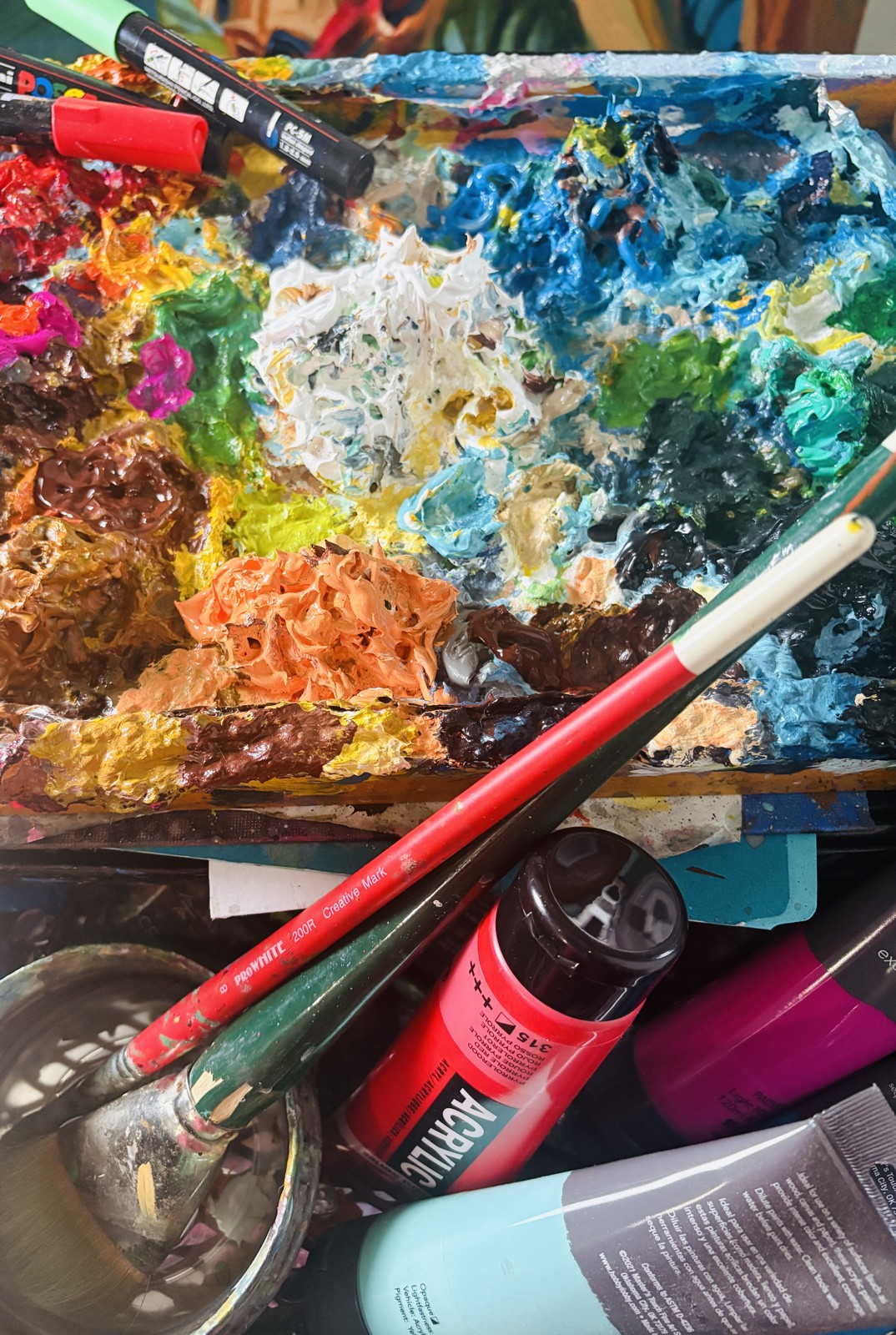
VicTorres’s paint palette and brushes
On the palette

Influences

Starlog
MAD Magazine
Wacky Packages
Garbage Pail Kids
Cracked Magazine
VHS
MADCRACKEDGPKMARVELVHS80s TOYSB-MOVIESCOLD WAR PARANOIAHORROR HOSTSSATIRE

Events / Articles

Upcoming shows, exhibitions, and writing by VicTorres.
Out in the world

Upcoming Shows

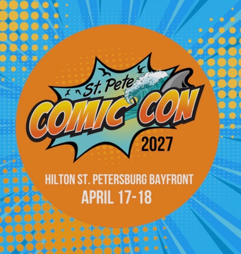
St. Pete Comic Con 2027 — April 17–18

St. Pete Comic Con

April 17–18, 2027

Hilton St. Petersburg Bayfront
Find VicTorres at Booth H8

Tickets & event details ↗

Shop Gloomy Giggles

Starlog

Starlog from VicTorres’s collection

Before the internet, before movie websites, fan forums, YouTube breakdowns and social media giving us a new piece of movie news every fourteen seconds, there were genre movie magazines.

In the ’70s and ’80s, publications like Starlog, Cinefantastique, Fangoria, Cinefex and a whole galaxy of lesser-known horror, science-fiction and fantasy magazines were our connection to the movies. If you were a kid obsessed with monsters, spaceships, robots, special effects and anything involving an exploding head, these magazines were essential reading.

They were our internet.

Only the internet arrived once a month.

You’d go to the newsstand and scan the racks, looking for the latest issue like a starving man searching for scraps. Then you’d rush home, rip open the plastic, and begin your investigation. What was being filmed? What was coming next? Who was directing it? What creature was being built? What new special effect was some mad genius attempting in a warehouse somewhere?

And the coverage could be gloriously excessive.

A movie that, in retrospect, might have been the cinematic equivalent of a gas-station hot dog could receive a six-page spread describing its production with the seriousness normally reserved for Citizen Kane. The writer would enthusiastically explain the director’s “vision,” the groundbreaking special effects, the revolutionary makeup techniques and the filmmakers’ ambitious plans for the future of cinema.

Meanwhile, you’re looking at a photograph of some guy in a rubber monster suit standing next to a plywood spaceship.

And you loved every minute of it.

The filmmakers themselves seemed equally determined to convince you that they weren’t making some shlocky B-movie that would disappear into the Saturday-night movie graveyard. No, this was an event. This was going to redefine the genre. This was going to scare audiences shitless. This was going to push special effects to places they had never gone before!

Sometimes they were right.

Sometimes the movie came out and you thought, “Well, that was certainly a….movie.”

But that was part of the fun.

These magazines treated every production like it mattered—and to us, it did. A behind-the-scenes photograph of an unfinished creature, a miniature spaceship or an actor covered in prosthetic makeup could send your imagination into overdrive. You were seeing pieces of a movie months before you could actually see the movie.

There was also something wonderfully mysterious about the whole process. Information didn’t arrive instantly. It trickled in. Month by month. Issue by issue. A little production photo here. A casting announcement there. A paragraph about a sequel that might—or might not—ever happen.

It was like receiving movie news over a telegraph wire.

FILMING BEGINS STOP MONSTER LOOKS AMAZING STOP RELEASE DATE UNKNOWN STOP MORE NEXT MONTH STOP

And you waited.

That slow drip made movies feel bigger somehow. You weren’t drowning in information. You were starving for it. Every new issue gave you just enough to keep the anticipation alive until the next one.

Looking back, those magazines weren’t simply publications. They were portals into movies that didn’t exist yet—filled with rumors, photographs, production artwork, interviews, promises and occasionally wildly optimistic claims about movies that absolutely did not deserve that much attention.

But we didn’t care.

For a kid who loved genre cinema, they made the waiting almost as exciting as the movies themselves.

MAD Magazine

MAD Magazine from VicTorres’s collection

MAD Magazine was one of the earliest influences on how I learned to make art. As a kid, I wasn’t just reading MAD for the jokes—I was studying the drawings, copying the artists’ styles, and trying to figure out how they created those exaggerated characters and visual gags. Eventually, I started making parodies of cartoons and TV shows of my own. I would photocopy them and sell the copies in the schoolyard for a dollar. Looking back, I realize I was already doing a primitive version of what I do today: taking familiar characters and images from popular culture and twisting them into something funny, absurd, and sometimes a little dark. That connection to MAD is deeply personal because it didn’t just influence my sense of humor—it helped shape the kind of artist I became. The MAD I grew up with is largely gone now, and I genuinely miss it. When I paint today, I sometimes imagine myself sitting in that chaotic MAD art department, surrounded by the other artists, working furiously on a ridiculous painting against some impossible deadline—and quietly cracking myself up, hoping the guys around me are laughing too. In those moments, it feels like that kid in the schoolyard never really left; he just traded his photocopier for a paintbrush.

Wacky Packages

Wacky Packages from VicTorres’s collection

Topps started in Brooklyn in 1938 as a candy company, but the little pieces of cardboard packaged with its candy would eventually become a pop-culture institution. In 1951, Topps introduced its first major baseball card set, helping establish the bubble-gum-and-trading-card formula that became a childhood staple.

But Topps soon discovered there was plenty of room beyond baseball. The company began turning pop culture, advertising, horror and science fiction into miniature pieces of illustrated insanity. One of the earliest—and most infamous—examples was Mars Attacks, released in 1962. Inspired by the lurid science-fiction and horror imagery of the era, Mars Attacks depicted grotesque, bug-eyed Martians invading Earth with flying saucers, ray guns and absolutely no respect for human life. The paintings by Norman Saunders were spectacularly gruesome and cinematic—cities burned, people were vaporized, animals were experimented on and humanity generally had a very bad afternoon. The cards looked like miniature movie posters for movies that didn’t exist. They were colorful, dramatic and often disturbingly violent. Naturally, kids loved them.

A few years later, Topps found another way to turn everyday American life into satire with Wacky Packages.

First introduced in 1967, Wacky Packages took familiar products from the supermarket shelf and twisted their names, packaging and personalities into ridiculous parodies. It was advertising turned against itself. Products that were supposed to make us want to buy things became jokes about the absurdity of consumer culture. For a kid, there was something particularly satisfying about seeing the familiar world transformed like that. You knew the real product. You recognized the package. And then someone had taken that familiar image and completely screwed with it. The artwork was bright, detailed and packed with visual jokes. The cards rewarded you for staring at them.

By the 1980s, Topps had essentially perfected this particular formula: take something familiar, turn it upside down, make it ridiculous, and illustrate the hell out of it. Mars Attacks had brought science fiction and horror into the mix. Wacky Packages had weaponized advertising and consumer culture.

Then, in 1985, Topps took that same basic idea of parody, irreverence and beautifully rendered weirdness and aimed it directly at one of the biggest children’s crazes of the era.

Garbage Pail Kids. (To be continued…)

Garbage Pail Kids

Garbage Pail Kids from VicTorres’s collection

Created as a grotesque parody of the enormously popular Cabbage Patch Kids, Garbage Pail Kids replaced adorable dolls with disgusting little monsters suffering every conceivable indignity. They exploded, melted, puked, got smashed, decapitated and generally experienced childhood in ways no responsible parent would recommend.

The concept was ridiculous. The artwork was incredible.

Artists including John Pound, Tom Bunk, Jay Lynch, James Warhola and others created a world where grotesque characters, absurd names and elaborate visual gags all existed in the same tiny rectangle of cardboard. The cards were stickers, but the illustrations had the detail and personality of comic-book or poster art.

And once again, Topps had found the perfect formula: take something familiar, make it colorful, make it funny, make it slightly disgusting and push it just far enough over the line.

For me, these cards were formative.

I loved that they didn’t take the world seriously. They took familiar things—brands, toys, movies, childhood innocence—and twisted them into something funny, grotesque and occasionally disturbing. The artwork itself was a huge part of the attraction. The paintings were colorful, detailed, ridiculous and completely committed to the joke.

I would spend hours looking at the different artists’ styles, studying how they drew faces, characters, expressions and environments. I would copy them and try to emulate what I was seeing. Without really realizing it at the time, I was learning that there wasn’t just one way to make a picture funny—or even one way to make it look good.

Topps had assembled a remarkable group of artists whose work demonstrated that commercial art could be clever, beautifully painted, culturally observant and completely ridiculous at the same time.

That combination—bright colors, familiar imagery, nostalgia, satire, absurdity and a slightly nasty sense of humor—is a big part of the DNA of Gloomy Giggles.

Topps showed me that something could make you laugh while simultaneously being a little wrong. That a familiar piece of childhood could be turned upside down. That something colorful and fun could contain a darker joke underneath.

Cracked Magazine

Cracked Magazine from VicTorres’s collection

Like MAD, Cracked magazine was part of the visual language I grew up with. I remember finding those magazines on newsstands (when the world had them) and getting lost in the ridiculous artwork, movie parodies, monsters, celebrities, and beautifully dumb jokes. Cracked had a scruffier, slightly more chaotic personality than MAD, and I loved it for that. As a kid who was already obsessed with drawing, movies, comics, and making fun of everything, those pages felt like permission to be irreverent—to take something familiar and twist it into something completely absurd. Looking back, I can see how much that sensibility stuck with me. The exaggerated characters, pop-culture parody, dark humor, and willingness to make absolutely anything the butt of a joke are all things that eventually found their way into my own paintings. Sadly, like MAD, Cracked is no longer in regular publication, and another piece of the weird, wonderfully irreverent magazine culture I grew up with has disappeared. But for me, it never really went away.

VHS

VHS from VicTorres’s collection

There was something magical about the mom-and-pop video stores of the 1980s. They weren’t just places to rent movies—they were little kingdoms of possibility.

One of mine was Video Kingdom.

I remember walking in and feeling like I had entered another world. Before you could rent anything, you had to become a member, and the membership could cost a couple hundred dollars. That seemed like a fortune for the privilege of taking home a plastic box for a couple of days.

But once you were in, the shelves were yours to explore.

I could spend forever wandering through the horror, science fiction, exploitation and B-movie sections. I’d pick up a VHS, study the artwork, read the back, put it down, then immediately pick it up again.

There was no internet, no Rotten Tomatoes, no IMDb telling me what to watch.

I had the box.

If it had a giant monster, a screaming woman and an exploding building on the cover, I was probably renting it.

And the movies didn’t have to be good. Sometimes the spectacularly crappy ones were the most fun.

Eventually the big chains arrived, and those wonderfully weird neighborhood stores began disappearing. Everything became cleaner, more standardized and predictable.

But I still remember Video Kingdom.

It was my little kingdom of cinematic garbage—and I loved wandering those aisles, never knowing what bizarre movie I was going to discover next.